


Branding, packaging, and marketing assets designed for a debonair cookie company based in San Francisco.
Branding, packaging, web design, photography, and marketing assets created for a debonair cookie company based in Northern California.
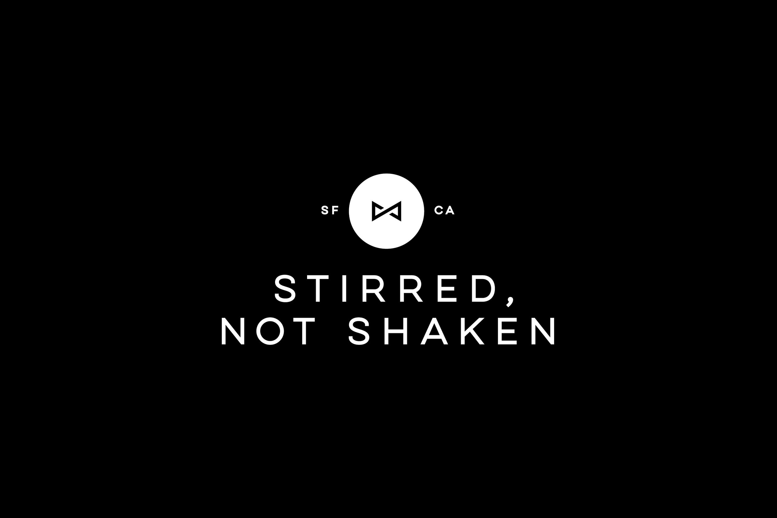
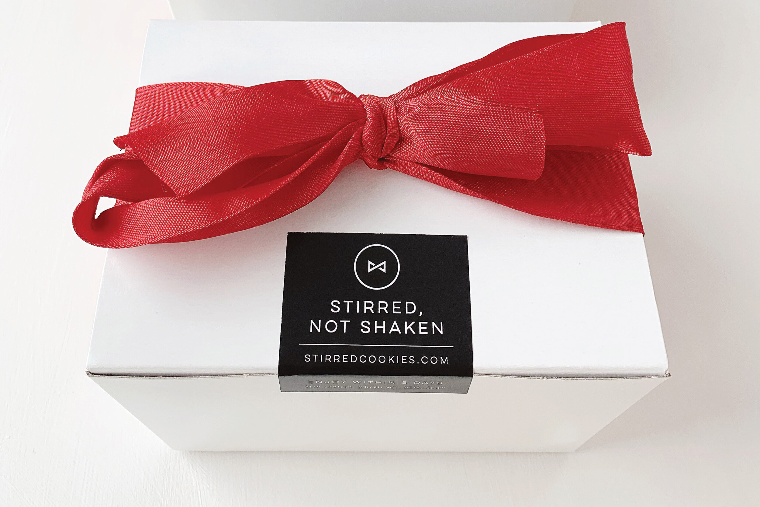
To honor this company’s homage to a certain fictional British spy, the branding and packaging makes a posh and polished impression. The logo features a circle (ahem, a cookie) that encompasses a minimal bow tie, simulating a sideways “S” for the company name. The black and white color palette imparts a sharp, clean, distinguished feel, allowing the product itself to bring natural colors and textures to the experience.
Client: Stirred, Not Shaken Cookies
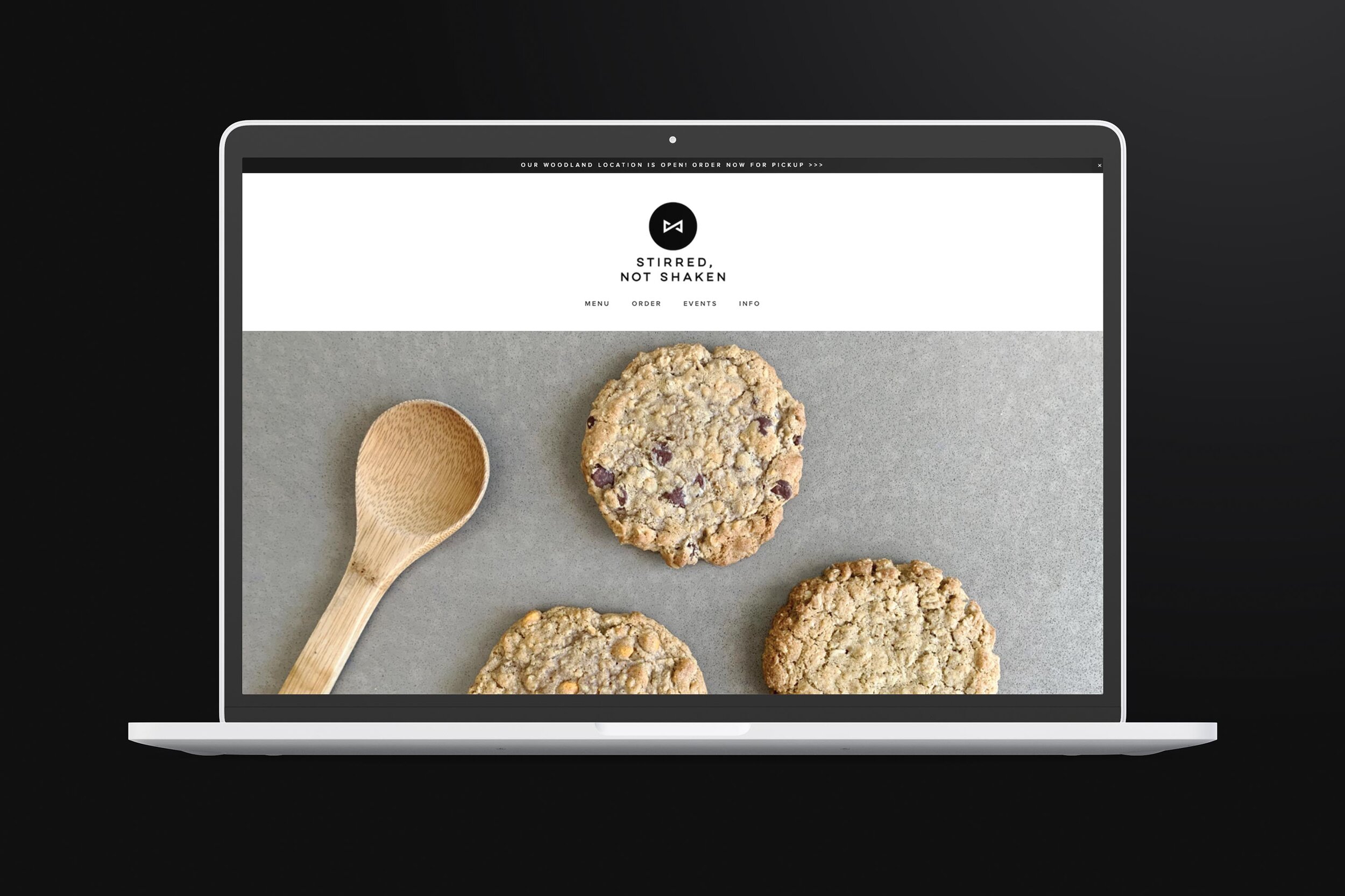
Services: Branding, Logo Design, Packaging, Photography, Signage, Social Media Assets, & Web Design
View live website at: www.stirredcookies.com